Sitting with blank space is hard. I’ve blogged my way through a host of living situations — most recently, our RV — and have shared the same sentiment over and over. When we occupy a new space, we’re met with boxes, baggage, stress, and an unspoken pressure to make the space “ours” immediately. We expect to infuse character, life, and taste into a home we’ve made more messes in than memories.
But like any good thing that’s worth doing, making a space reflective of your family and your life takes time, sometimes a lot of time. Similar to the process of creating a capsule wardrobe or defining your personal style, making a home is a labor of love that’s bound to include decisions you look back on later and face palm, pieces you keep forever and ever, and blank spaces you never can quite decide how to or if you should fill.
As challenging as decorating a small space was, having six times the amount of space to fill has proved to be just as overwhelming in different ways. Our living room has come together first and, although I’m sure it will change over the years, I feel a sense of completion and coziness (my ultimate gauge for anything) when I step into it and that feels good.
I’m excited to share some of the phrases I repeated to myself when I was trying to figure out how to style the room and what pieces to bring in to the biggest room in our house and the one we’re all in the most. I wanted it to feel calming, neutral, and not overdone. Another specific challenge was trying to make our tv blend in a bit. The floating shelves add some visual interest to the wall and, I hope, something prettier to look at instead of turning to the tv automatically.
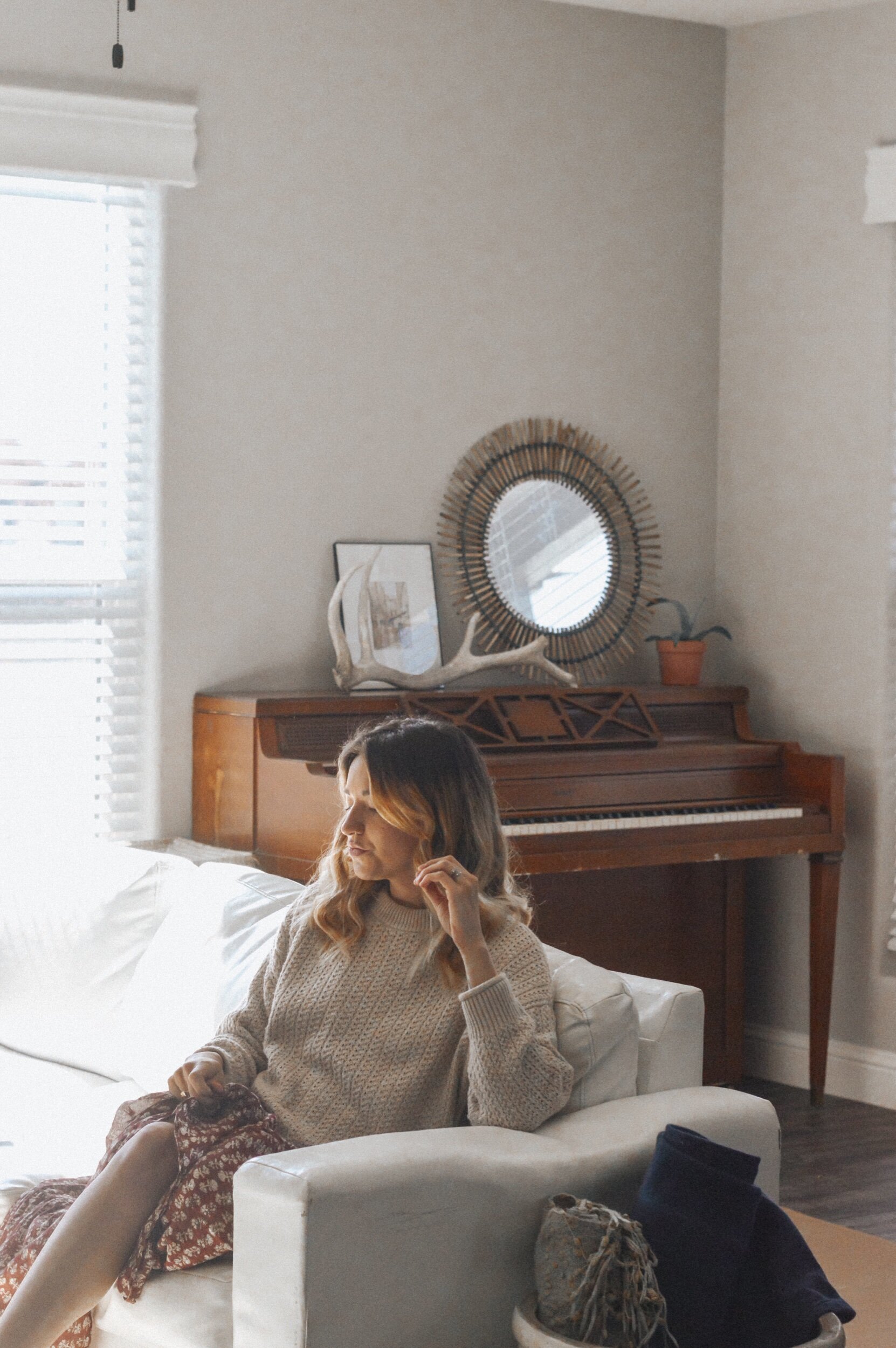
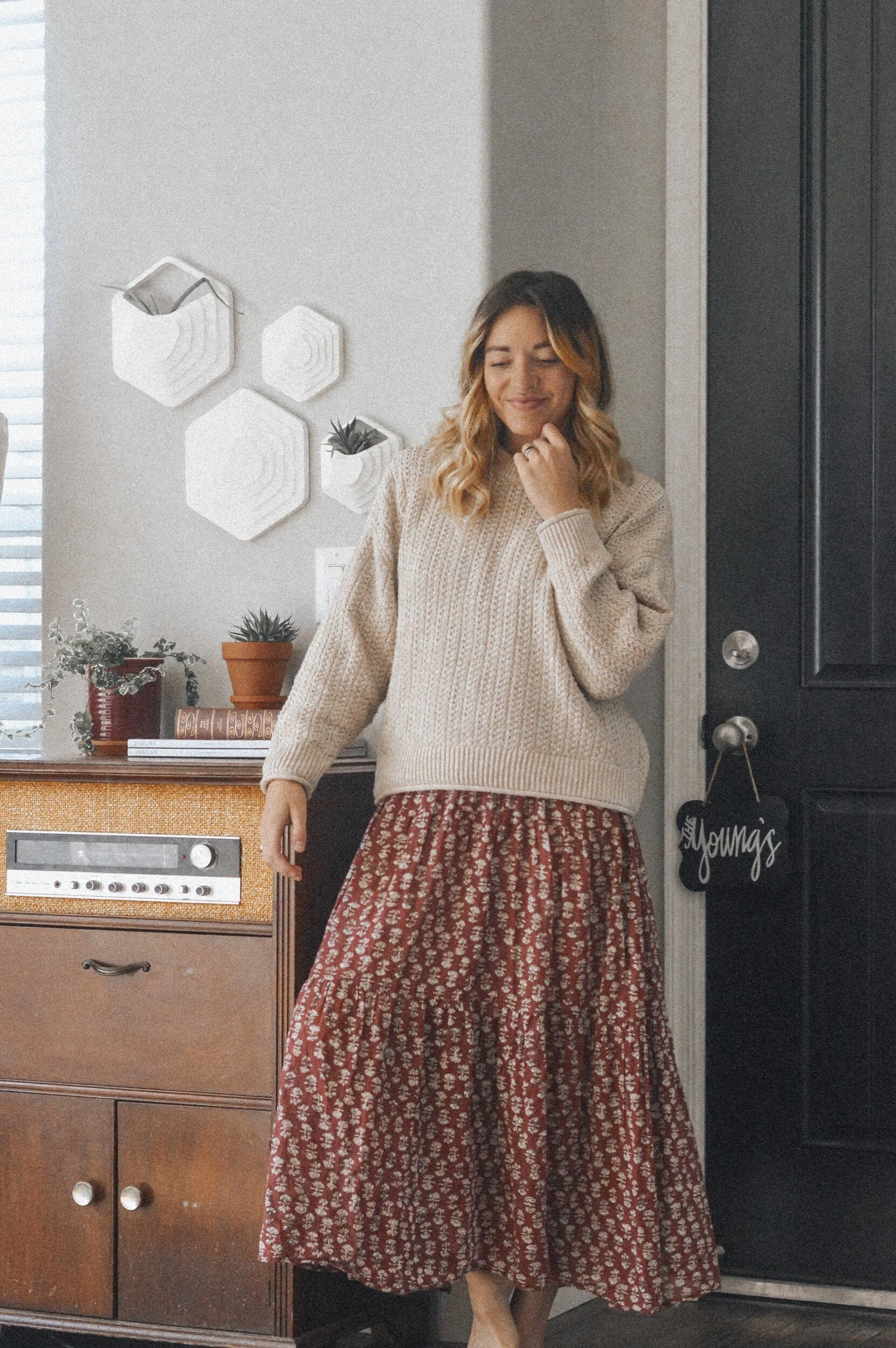
The “piano room” was one of my first visions of our home and I knew immediately what I wanted that space to be. I want my girls to have easy access to music and this open space gives room for dancing, playing, drawing, and creating. The record player was my great grandfather’s and I love it as an entryway “table” instead of something more traditional.
Ramblings aside, I’m excited to have some sense of completion in hone of our rooms and hope these small tips help with the spaces you’re creating too:
1. Don’t be afraid of blank walls
I used to equate empty space with “lack” or something that needed filling. I pressured myself to fill each space or have photos in each room to make it feel complete. After tiny living for a season, I quickly fell in love with blank space and learned to embrace it, using contrasting space that wasn’t always even or balanced and learning to love the beauty in that too.
We have empty cabinets in our kitchen that I have no desire to fill. There are walls in our home that I’m not pressuring myself to decorate. Although the living room is quite full already, I tried to include a sense of “not too much-ness” that gives me permission to change it as I go.
2. Think of decorating as an evolution
Spaces evolve over time. When you release the pressure to create permanence, it gives you permission to make mistakes and rearrange or edit later. It isn’t a science, so don’t treat it like one.
3. Use what you have
I’m sort of shocked with how quickly we’ve filled 1800 square feet after living in 260, but aside from a few Facebook marketplace finds and some giftings, our decor was all pieces I scrounged together as I unpacked. I found photos in old editions of Darling Magazine to fill my frames, I used antique books from our grandparents’ as props and filled vases with dried branches and plants my girls found outside. You don’t have to spend 100’s on new art, just use what you have.
4. Infuse old with new
Our home is a new build, so it felt very stale and “unlived in” when we first moved in. As someone who is drawn to old spaces and fixer uppers, it felt like our space lacked character until I brought in mostly thrifted/vintage items that instantly “aged” our stark new space.
5. Create functional beauty
Much like with a wardrobe, functionality trumps form sometimes. Finding a balance of pieces that serve a purpose and look good while they’re at it is key. Our vases and planters from Casa Z we’re the perfect functional pieces that add visual interest, but still serve a purpose.
Speaking of Casa Z, they’re an amazing resource for eco-friendly and modern design. All of their pieces are made with 3D printing and are made from PLA plastic that is biodegradable (derived from corn starch or sugar cane), lightweight, and durable. They fuse technology with design in a beautiful way and their products fit well into any space that needs livened up with modern and unique design.
As I mentioned before, almost everything else is either found, thrifted, or made/upcycled. The challenge of making a home on a budget is something I’ll never tire of, no matter how many times I rearrange or how many blank walls I force myself to embrace.
What is your home design strategy? Do any of these ring true for you too?
*Thank you to Casa Z for sponsoring this post! All imagery and creative direction are my own.*


